
Designing a timepiece can’t be a blank slate. Everyone knows what a watch ‘is’ and carries in their mind an expectation of form and function. If it’s to be worn on the wrist and seen with the eyes, there’s a fairly narrow band of physical formats that will work.
Of course, there are designers who have set out to ‘break the mold’ of our expectations – take a look at these: Nooka Urwerk MB&F

We’ve taken a different approach – one of subtly. Our goal is to follow conventions but then to gently play with them. Our first design, the View, is at first glance ordinary. The dial is round; there’s a chapter ring with numbers around the edge.

If you’re looking at the dot-screen version, you might notice that the face is not solid, you see a hint of motion within. Now you’re engaged, you have to get a closer look to see how this works!
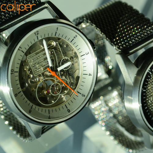
Our didactic version has a more obvious transparent face, but it might take you a while to discover the text and call-outs. You’ll need to get up-close to see what’s going on here.
The Caliper View is elegant rather than flashy. It’s a design that becomes more interesting the closer you look. The View rewards your attention.

Our philosophy is that we should not adorn or decorate, but rather that we should create a delightful user experience by enhancing, gently amplifying and re-presenting what is inherently ‘there’ within the product itself.